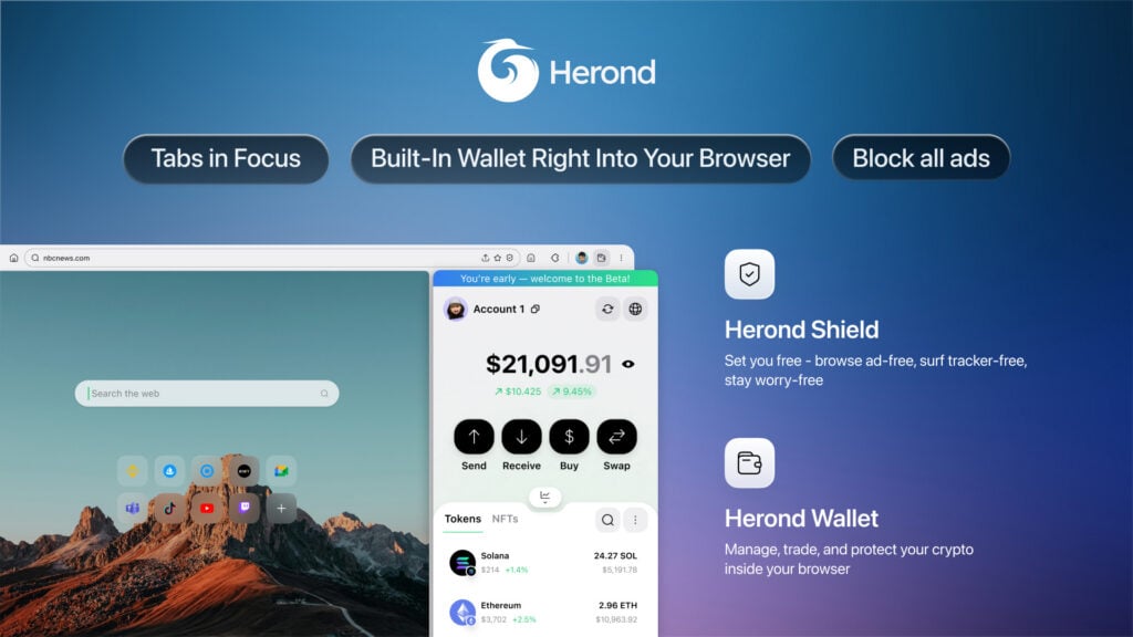


The Herond Browser has always stood for speed, security, and smarter browsing. Now, as part of our bold Herond rebranding initiative, we’re thrilled to introduce the new Herond logo, a Browser logo redesign that captures our fearless evolution and future-ready vision.
This isn’t just a visual refresh; it’s a symbol of our commitment to innovation. Sleek lines, dynamic energy, and intuitive symbolism reflect the seamless power of the Herond Browser rebrand, making it instantly recognizable in a crowded digital landscape.
Curious about the inspiration, design process, and what this new Herond logo means to you? Let’s break it down.
The Meaning Behind “Herond”: Heron + 3D
Herond emerges from “Heron” – the majestic migratory bird symbolizing freedom, wisdom, and unparalleled navigation – fused with three powerful Ds: Defend, Discover, Decentralize.
- Defend: Safeguarding users, data, and privacy in an increasingly vulnerable digital world.
- Discover: Unlocking boundless exploration of a vast, new internet frontier.
- Decentralize: Empowering users in the Web3 era, putting you in control.
The name Herond embodies the heron’s free-spirited flight, while spotlighting our core Herond Browser mission as part of the Herond rebrand: protect, guide discovery, and pioneer a decentralized network where you hold the reins.
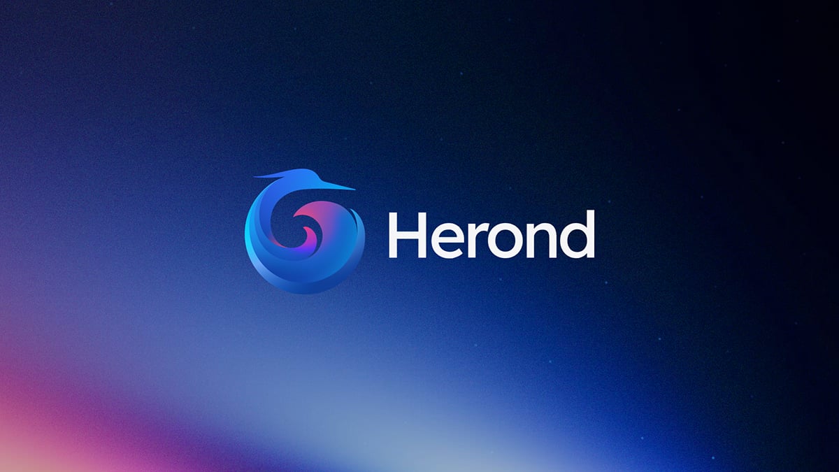
Decoding the Herond Browser Logo: A Visual Manifesto of Our Rebrand
The Herond Browser logo is a bold visual declaration of our brand philosophy – where every curve and color tells our story of freedom, protection, and Web3 innovation.
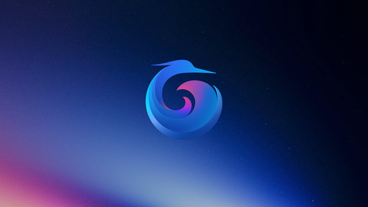
The Heron Silhouette
Styled as a dynamic heron in flight, it embodies grace, freedom, and the ability to soar beyond limits – the core spirit of a future-forward Web3 browser.
Protective Circle
Sweeping curves form a protective ring, symbolizing safety, integrity, and seamless connectivity. This is our promise: the Herond Browser always shields your data and privacy.
Fly Freely – Flight Path Inspiration
The fluid, twisting structure mimics unbound flight, representing limitless exploration and the open essence of Web3.
Dawn Colors – The Dawn
A gradient shifting from deep blue to purple and pink evokes sunrise – the dawn of a new era. Herond heralds a free, transparent, decentralized browsing experience.
Universe Map – Cosmic Colors
Layered color transitions paint a cosmic universe: vast, mysterious, infinite. This mirrors the Herond Browser as your gateway to the expansive Web3 world.
Hot Core – Core Energy
The vibrant pink-purple center represents a pulsing energy core – symbolizing raw power, innovation drive, and cutting-edge tech.
The Core Message
Built on three pillars: Defend, Discover, Decentralize – the logo fuses Herond Browser’s brand meaning with the heron’s symbolism: protect, guide, and empower.
From the graceful heron silhouette to the cosmic dawn gradients, every element of the new Herond Browser logo embodies our unbreakable commitment: Defend your privacy, Discover infinite possibilities, and Decentralize power back to you.
This isn’t just a Herond rebrand. It’s your invitation to a freer, safer, smarter website. The future of browsing has landed.
Ready to experience it? Download the Herond Browser today and join the flight.